Histograms
Provide a frequency distribution of the results submitted by all participants. The blue bar represents the median or target result, the blue circle indicates the participant’s result.
The Immunology discipline supplies a variety of report styes that provide a direct comparison of individual participant results with all results received and graphical representations showing results from the same method, instrument and reagent groups (if applicable). Participant results will be compared to a calculated median or target from all method classifications for a particular test as well as comparing results within the main variable of the method system for the measurand. Survey reports are issued after the scheduled closing date.
Analysis of results using robust statistics requires a minimum of six (6) or more results and assigned targets are determined by 80% consensus.
For all other programs, targets are qualitative (e.g. Normal, Equivocal, Elevated or Not Detected / Detected / Equivocal/ Indeterminate) or descriptive (e.g. ANA pattern). These targets are set and based on 80% consensus or in consultation with the clinical advisory committee using the clinical information available/gold standard test results. These programs provide reports that have been tailored specifically for each module.
All Immunology reports are structured to provide:
The Immunology discipline provides programs that are fully quantitative and will adopt the Quantitative reporting system. Examples of programs include Specific Proteins, Rheumatoid Factor, Immunoglobulin E, Phenotyping programs.
The remainder of the Immunology program targets are qualitative (e.g. Normal, Equivocal, Elevated or Not Detected / Detected / Equivocal / Indeterminate or descriptive (e.g. ANA pattern). These targets are set based on 80% consensus or in consultation with the clinical advisory committee using the clinical information available/gold standard test. These programs provide reports that have been tailored specifically for each module.
Survey Reports summarise every pair of specimens for each measurand and provide summary data on your performance throughout the cycle. Reports provide a graphical comparison of individual results with all results received and with participants using the same method categories – examples are the analytical principle, measurement system and reagent source.
Quantitative results are usually compared with the specific target value (if known), the “overall median” or the median of the main variable of the category median. Analytical Performance Specifications (APS) are set either side of the expected value. Non-numerical results (descriptive results) are compared with a target value or overall method group consensus.
The Analytical Performance Specifications (APS) are unique for each measurand, and the acceptable range for each specimen is calculated from the central value (target, median or weighed-in value). These ranges are displayed in the report histograms and Youden Plots. The comment “Low” or “High” is added if the result is outside the APS and will be highlighted for review.
Note: The z-score is provided as an additional parameter to demonstrate the number of standard deviations a participant’s result is away from the mean value. It measures performance based on what is achievable from test methods. Participants are not assessed against the z-score.
The new report format follows a standard structure for all disciplines that survey quantitative measurands with two samples in each survey challenge.
The survey reports incorporate linear regression analysis to determine the precision and accuracy of the testing procedure.
Some programs allow participants to submit results in SI or mass units. The report will default to the units submitted by the laboratory.
If survey results are not received by the close date an appropriate message is returned.
The structure of the report is as follows:
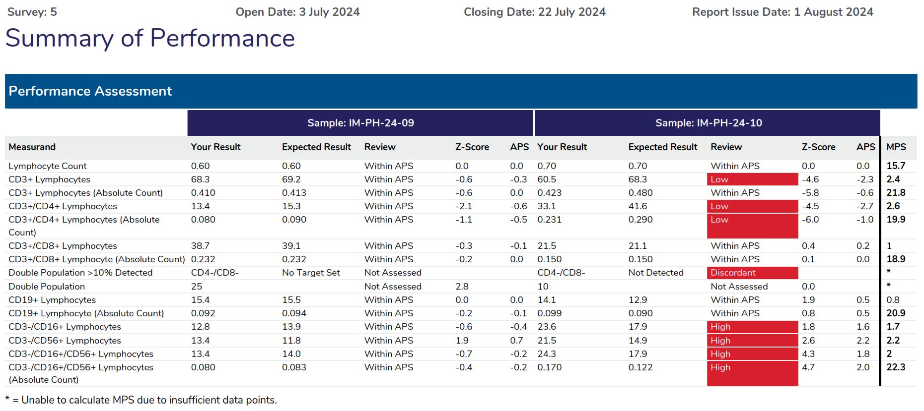

The Summary of Performance provides participants with an assessment of their overall performance and indicates what measurands require further review.
APS score calculation
Measurand APS: APS +/- 0.5 up to 5.00, +/- 10.0% > 5.00 x10⁹ cells/L (5.0 is the measurand decision point)
| Lab result above decision point Lab result = 19.30 (above decision point – 10% range) Target result: 18.40 Measurand limit: 10% of 18.40 = 1.840 APS Score = (19.30 – 18.40) / 1.840 APS Score = -0.49 |
Lab result below decision point Lab result = 2.90 (below decision point – 0.5 range) Target result: 2.60 Measurand limit: 0.5 APS Score = (2.9 – 2.6) / 0.5 APS Score = 0.6 |
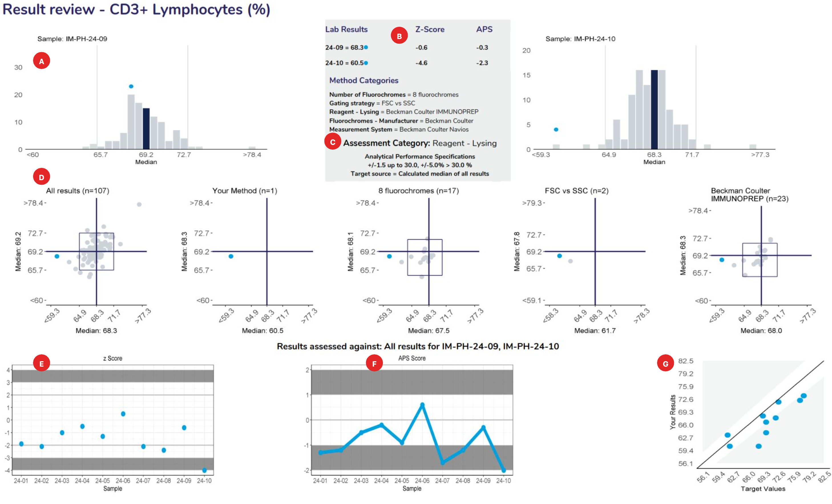
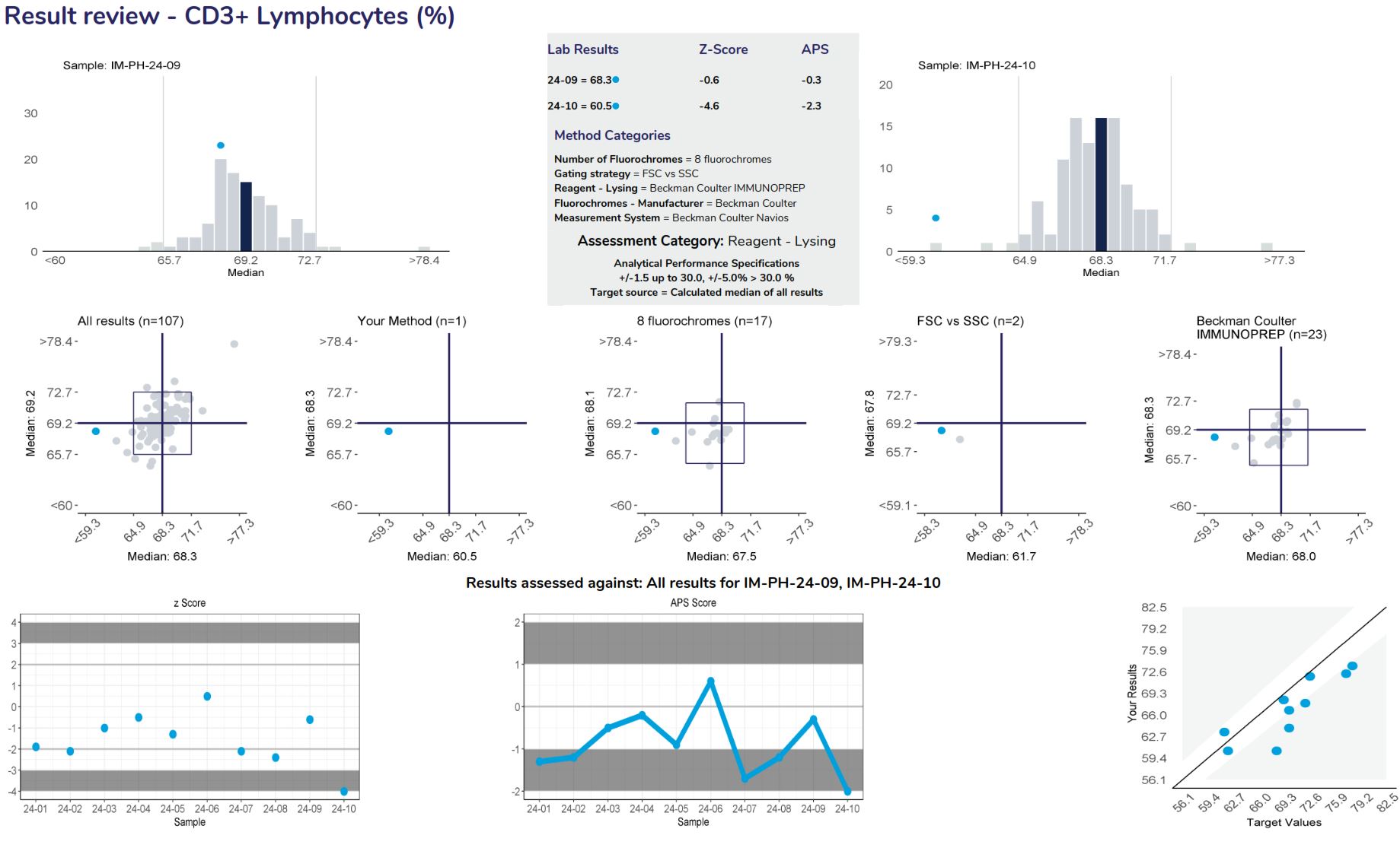
Provide a frequency distribution of the results submitted by all participants. The blue bar represents the median or target result, the blue circle indicates the participant’s result.
Lists the results and method categories returned by the participant.
The APS that has been assigned to the measurand.
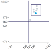
Represent a scatter of two sample results plotted against each other. The sample with the higher measurand level is on the y-axis plotted against the lower level on the x-axis. Five Youden plots are presented and illustrate from left to right, results from all results, the participant’s method, analytical principle, measurement system and the reagent. The participant’s result is highlighted by the blue dot.
Examples of Youden charts
| Biased results | Biased Laboratory |
 |
 |
Displays the participant’s z-score for up to 6 sets of returned results and provides an indication of the precision and accuracy of results within a survey year.
Displays the APS score for up to 6 sets of returned results and provides an indication of the precision and accuracy of results within a survey year.
Examples of Plots
| Imprecision | Bias |
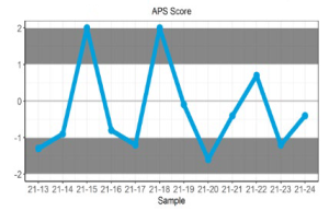 |
 |
Displays the participant result against the expected result, and indicates linearity across different survey sample levels.
Examples of Plots
| Imprecision | Bias |
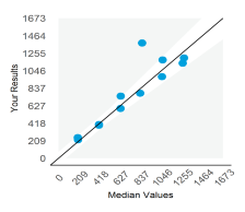 |
 |
Measurand performance: The Measurand performance page provides participants with a breakdown of the results returned.
Provide a frequency distribution of the results submitted by all participants. The blue bar represents the median or target result, the blue circle indicates the participant’s result.
Lists the results and method categories returned by the participant.
The APS that has been assigned to the measurand.
Represent a scatter of two sample results plotted against each other. The sample with the higher measurand level is on the y-axis plotted against the lower level on the x-axis. Five Youden plots are presented and illustrate from left to right, results from all results, the participant’s method, analytical principle, measurement system and the reagent. The participant’s result is highlighted by the blue dot.
Examples of Youden charts
| Biased results | Biased Laboratory |
 |
 |
Displays the participant’s z-score for up to 6 sets of returned results and provides an indication of the precision and accuracy of results within a survey year.
Displays the APS score for up to 6 sets of returned results and provides an indication of the precision and accuracy of results within a survey year.
Examples of Plots
| Imprecision | Bias |
 |
 |
Displays the participant result against the expected result, and indicates linearity across different survey sample levels.
Examples of Plots
| Imprecision | Bias |
 |
 |
Precision and Accuracy
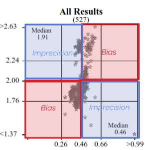
High / Low or Low / High = Imprecision
High / High or Low / Low = Bias
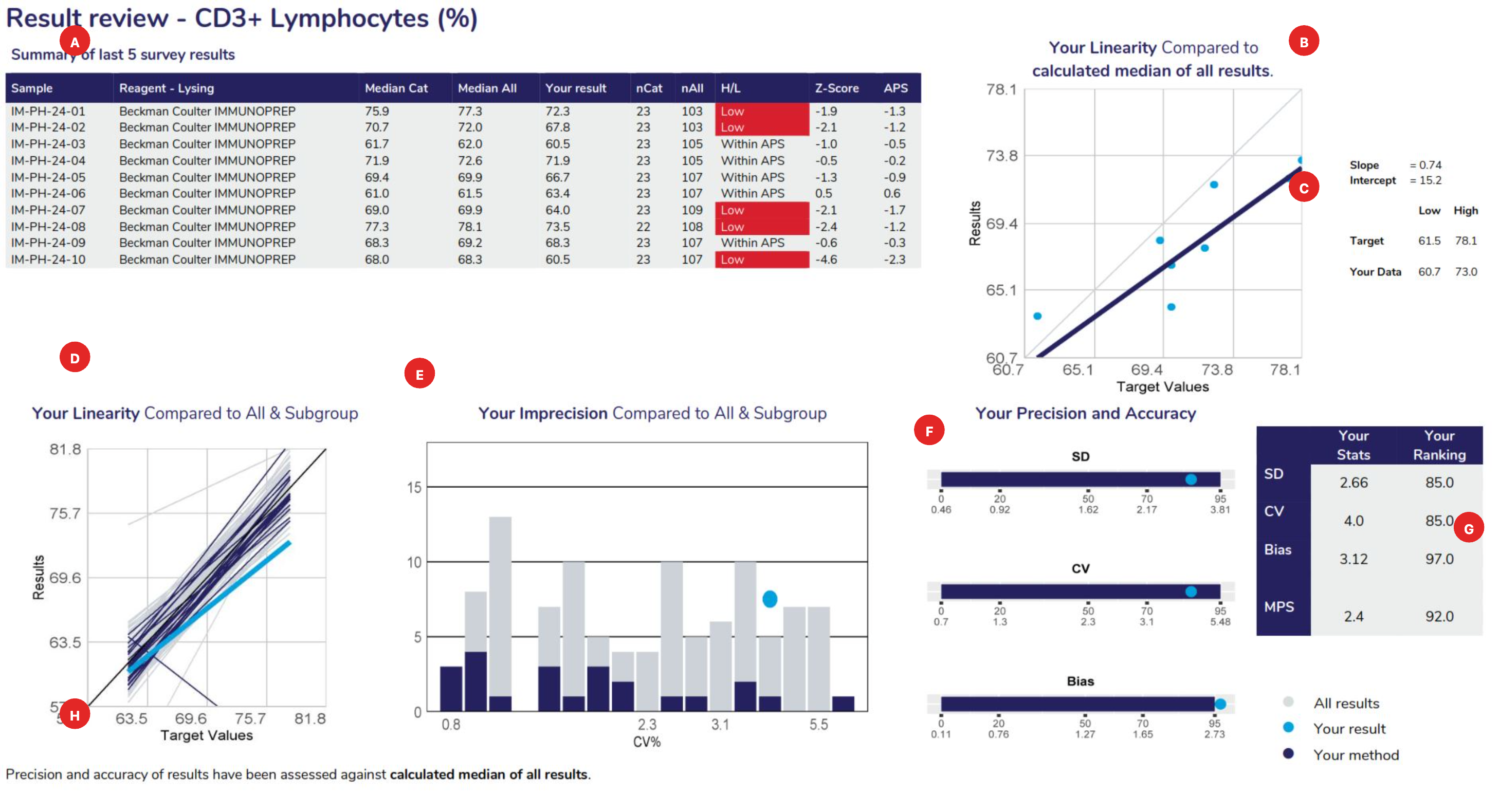

Displays the samples used to calculate linear regression analysis, the main method category value for this program (the CD3+ Lymphocytes example displaying the “reagent-lysing method – Beckman coulter IMMUNOPREP). The table columns represent the Sample ID, Measurement System category assigned for result comparison, median result for the method category, median of ALL results, participant’s result, number of results from the method category, number of results from all results submitted, High/Low review flag (W= Within APS, no review required), Z-score and the APS score.
Linear regression analysis is based against the target source of each sample, which could be the “median of all results”, “median of the assessment category” (measurement system) or the median of a “specified target”.
When performing linear regression, the following rules of assessment are applied:
Provides the slope and intercept calculated from the linear regression analysis. Also provides the target low and high level, with your corresponding low and high levels determined from the “line of best fit”.
Using the slope and intercept the values of your line of best fit are determined compared to the lowest and highest target values for the cycle.
To provide a comparison of all methods, linear regression is performed against the same data source (all results or specific target). The slopes represent the bias obtained from all laboratories, illustrating the slopes from all labs in ‘grey’, the slope from participants using the same assessment category in ‘navy blue’ and highlighting your slope in ‘light blue’.
This histogram represents the imprecision (CV%) obtained from all laboratories. It is calculated from the scatter around the target source linear regression line of best fit. The histogram illustrates all labs in ‘grey’, participants using the same assessment category in ‘navy blue’ and highlighting your CV% as a ‘light blue’ dot.
Provides participants with the SD, CV and Bias calculated from linear regression and how your results ranked against all laboratories that participated. Ranking (from 0 or best to 100, worst) is illustrated on the top row of the scale provided under the bar.
Standard Deviation: The SD is the standard error of the estimate (Sy.x) and can be regarded as the average SD across the range of concentrations analysed. SD provides a value in the units of the test. SD will tend to be high if you report high results and low if you report low results.
Coefficient of Variation: The SD divided by the mid-point of your laboratory’s range of concentrations, expressed as a percentage:
| CV%= | SD | x100 |
| (low value + high value)/2 |
| Average Bias: Your biases at the low value, high value and mid value are determined. These are the differences between the line of expectation (45° line) and your line of best fit. | 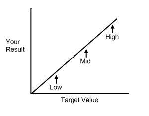 |
The average bias is calculated as:
| Bias = | [low bias] + [mid bias] + [high bias] |
| 3 |
Provides participants with a table summarising their SD, CV, Bias, MPS and performance ranking.
Provides participants with information, such as the target source used for linear regression (example displaying “calculated median of all results) and lists any method category changes made across the survey sample range being analysed.
Displays the samples used to calculate linear regression analysis, the main method category value for this program (the CD3+ Lymphocytes example displaying the “reagent-lysing method – Beckman coulter IMMUNOPREP). The table columns represent the Sample ID, Measurement System category assigned for result comparison, median result for the method category, median of ALL results, participant’s result, number of results from the method category, number of results from all results submitted, High/Low review flag (W= Within APS, no review required), Z-score and the APS score.
Linear regression analysis is based against the target source of each sample, which could be the “median of all results”, “median of the assessment category” (measurement system) or the median of a “specified target”.
When performing linear regression, the following rules of assessment are applied:
Provides the slope and intercept calculated from the linear regression analysis. Also provides the target low and high level, with your corresponding low and high levels determined from the “line of best fit”.
Using the slope and intercept the values of your line of best fit are determined compared to the lowest and highest target values for the cycle.
To provide a comparison of all methods, linear regression is performed against the same data source (all results or specific target). The slopes represent the bias obtained from all laboratories, illustrating the slopes from all labs in ‘grey’, the slope from participants using the same assessment category in ‘navy blue’ and highlighting your slope in ‘light blue’.
This histogram represents the imprecision (CV%) obtained from all laboratories. It is calculated from the scatter around the target source linear regression line of best fit. The histogram illustrates all labs in ‘grey’, participants using the same assessment category in ‘navy blue’ and highlighting your CV% as a ‘light blue’ dot.
Provides participants with the SD, CV and Bias calculated from linear regression and how your results ranked against all laboratories that participated. Ranking (from 0 or best to 100, worst) is illustrated on the top row of the scale provided under the bar.
Standard Deviation: The SD is the standard error of the estimate (Sy.x) and can be regarded as the average SD across the range of concentrations analysed. SD provides a value in the units of the test. SD will tend to be high if you report high results and low if you report low results.
Coefficient of Variation: The SD divided by the mid-point of your laboratory’s range of concentrations, expressed as a percentage:
| CV%= | SD | x100 |
| (low value + high value)/2 |
| Average Bias: Your biases at the low value, high value and mid value are determined. These are the differences between the line of expectation (45° line) and your line of best fit. |  |
The average bias is calculated as:
| Bias = | [low bias] + [mid bias] + [high bias] |
| 3 |
Provides participants with a table summarising their SD, CV, Bias, MPS and performance ranking.
Provides participants with information, such as the target source used for linear regression (example displaying “calculated median of all results) and lists any method category changes made across the survey sample range being analysed.
The assessment criteria are defined as measurand performance. As analytical error is due to both imprecision and bias, program organisers have defined Total Error as follows:
Total Error = 2SD + Bias
The quality of your laboratory’s performance is then determined by comparing the Total Error to the Analytical Performance Specification at the mid-point of the range of measurand concentrations for the cycle as follows:
| Measurand Performance Score (MPS) = | 2SD + Bias |
| Analytical Performance Specification |
These examples of bicarbonate analyses may assist in understanding this method of assessment.
Example – Laboratory 1
| SD = 0.8 mmol/L | Bias = 0.5 mmol/L |
| Total Error = (2 × 0.8) + 0.5 = 2.1 mmol/L | |
| Measurand Performance = | 2.1 | = 0.84 |
| 2.5 |
Note: When the Total Error is less than the Analytical Performance Specification then the Measurand Performance will be less than 1.0. This is the desired level of performance.
Example – Laboratory 2
| SD = 1.5 mmol/L | Bias = 0.1 mmol/L |
| Total Error = (2 × 1.5) + 0.1 = 3.1 mmol/L | |
| Measurand Performance = | 3.1 | = 1.24 |
| 2.5 |
An undesirable result – due predominantly to imprecision.
Example – Laboratory 3
| SD = 0.5 mmol/L | Bias = 2.0 mmol/L |
| Total Error = (2 × 0.5) + 2.0 = 3.0 mmol/L | |
| Measurand Performance = | 3.0 | = 1.20 |
| 2.5 |
An undesirable result – due predominantly to bias.

The method comparison provides a breakdown of all the methods (assessment category) used by participants and lists the statistics calculated for the latest survey results obtained (left) as well as the Precision and Accuracy results calculated from the linear regression analysis on the sample range used, providing the median values for each method listed, facilitating peer group comparison. The full set of statistics is seen only when there are four or more values in the dataset – three values in the dataset will illustrate the median value only and method categories with two or less users do not present any statistical data.
The “Survey Report Interpretation” flowchart can be found on the RCPAQAP website under “Resources” or can be accessed by clicking this link.
The following examples of reports adopt the standardised structure.

Method system used by your laboratory:
Performance Assessment:

The result review page displays histograms of the distribution of all survey results (grey), highlighting your method (dark blue) and your result (●).

The Method comparison section provides a breakdown of the results returned for each method used in the survey.

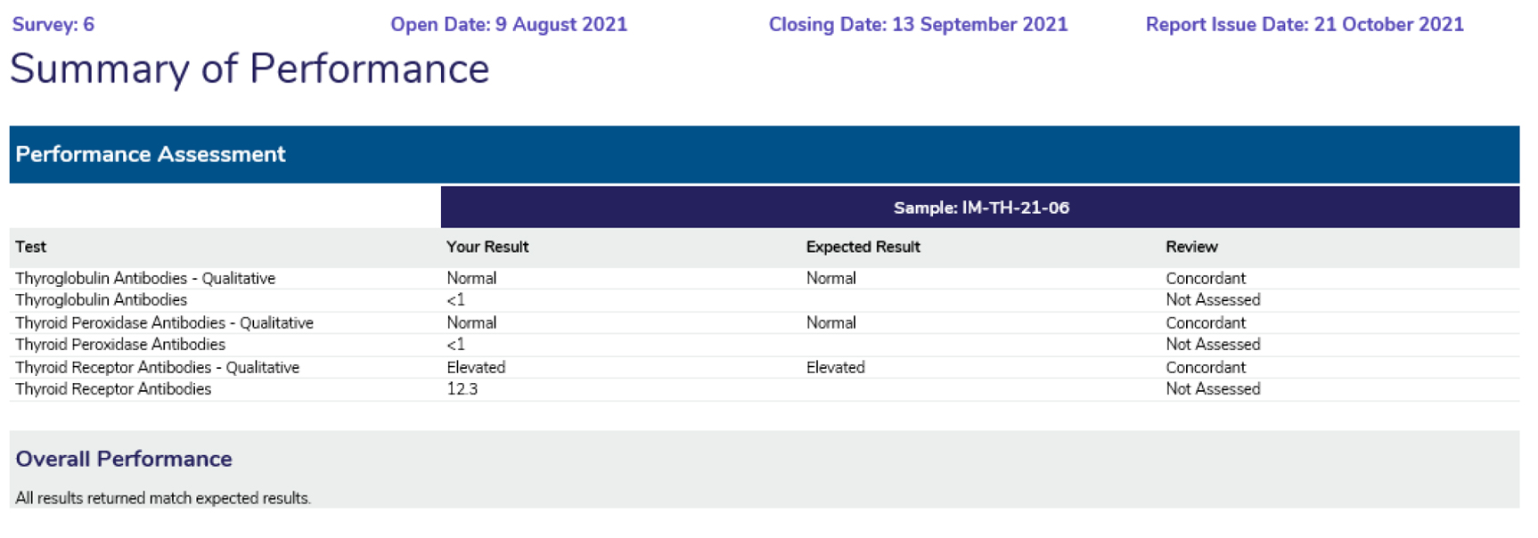
Provides a snapshot of participant performance over a survey year, displaying the results returned, the expected result and the Assessment provided.
Autoimmune reports are designed around common elements, although the reports differ subtly from each other.
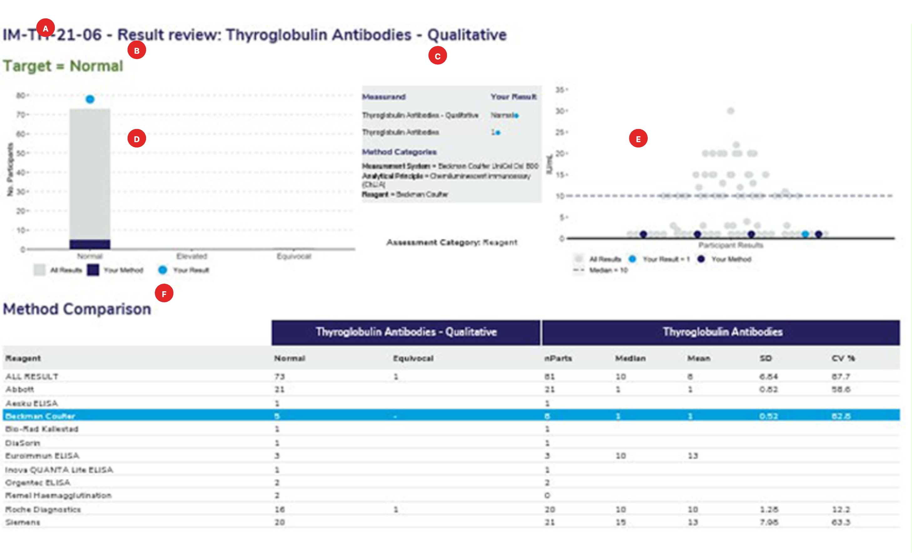
The survey sample ID and the full name of the measurand.
The target or expected result for the survey sample.
The survey results submitted for the qualitative and associated quantitative measurand. The method classification the laboratory has submitted. Ensure that your method classification is correct. If the method classification information provided by us does not allow for an adequate definition of your method then contact the RCPAQAP.
Histogram showing the distribution of all results. Results highlighted in dark blue are the peer group results representing the main variable in the test method. In this case, the reagent. The light blue dot (●) represents the participant’s result.
Scatterplot showing the distribution of all results (grey dots). Results highlighted in dark blue are peer-group results representing the main variable in the test method. The light blue dot (●) represents the participant’s result. The median is represented by a dashed line (—–) within the scatter of results.
Each report will provide a method comparison table to review the performance across all methods for the quantitative and the associated qualitative measurand. Groups with less than 4 users will not provide quantitative results with an SD or CV. Groups with less than 3 users will not provide a median or mean result.

Provides a snapshot of participant’s performance over a survey year, displaying the results returned, the expected result and the Assessment provided (review).

Method system used by your laboratory:
Summary of Performance:
Overall Performance:
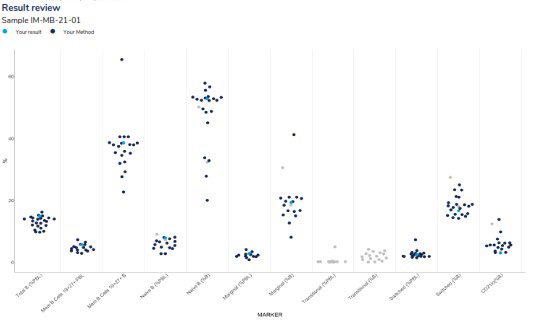
Provides a scatter of all results for all returned markers in a survey sample. Results highlighted in dark blue represent the participant’s peer group and the light blue dot (●) represents the participant’s result.

The statistical review provides an overview of the performance of each marker, which includes the number of users that tested the marker, the median, mean, standard deviation (SD) and Coefficient of Variation (CV).
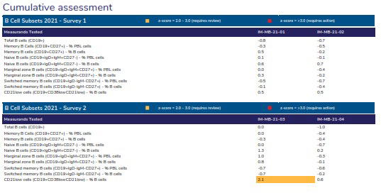
Provides the assessments over the survey year by listing the z-scores for each measurand tested by the participant.

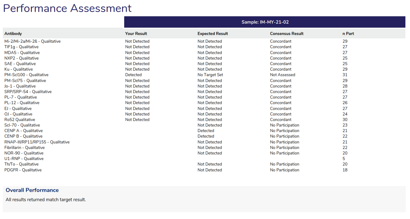
Performance Assessment: Provides a review of all antibodies tested by all participants.
Overall Performance: Provides an overview of the performance, listing any antibody that did not return the expected result.
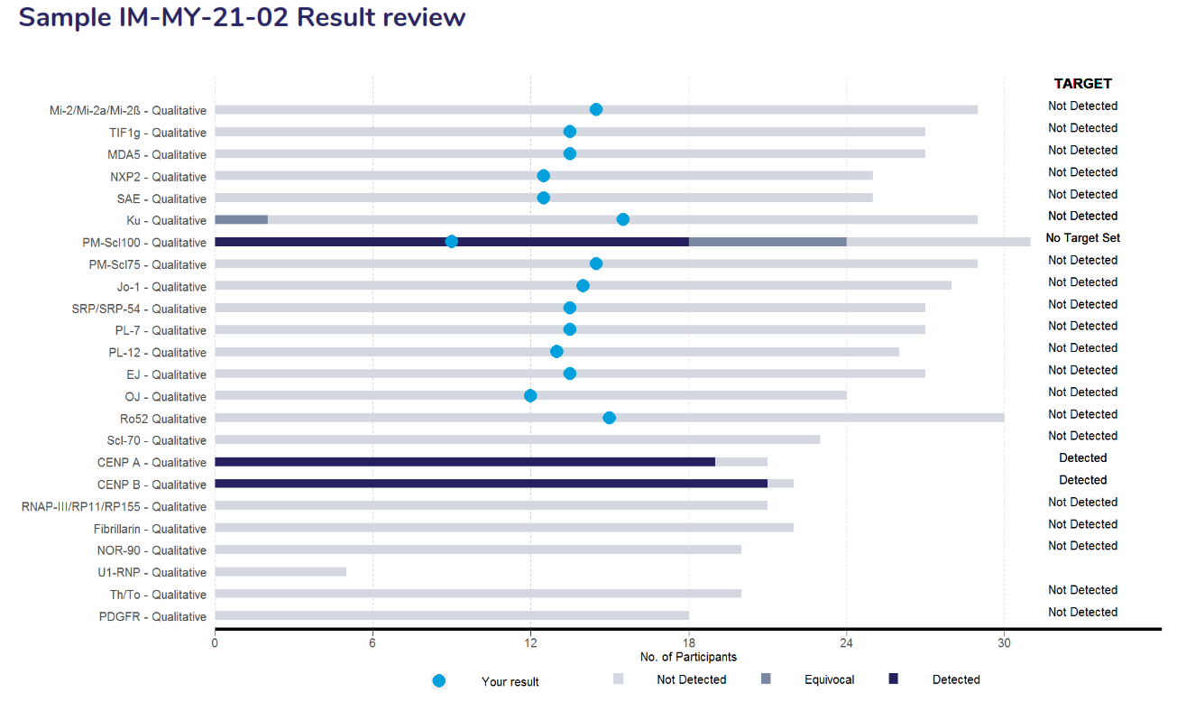
The result review page contains a stacked bar chart that displays the performance of the entire list of antibodies that was returned for the survey. The legend below displays the interpretive responses returned with the target for each antibody listed on the right side of the bar chart. Results highlighted as a light blue dot (●) represents the participant’s result.
 |
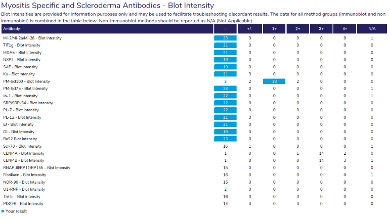 |
Provides an overview of participant responses for each antibody, including the number of results returned for each antibody, the interpretive response provided and an overview of the blot intensity in a separate table.

Provides a snapshot of the participant’s performance over a survey year, displaying the results returned, the expected result and the Assessment provided.