Histograms
Provide a frequency distribution of the results submitted by all participants. The blue bar represents the median or target result, the blue circle indicates the participant’s result.
The Haematology discipline supplies a variety of report styles that provide a direct comparison of individual participant results with all results received and graphical representations showing results from the same method, instrument and reagent groups (if applicable). Participants’ results will be compared to a calculated median from all method classifications for a particular test as well as comparing results within the main variable of the method system for the measurand. Survey reports are issued after the scheduled closing date.
All Haematology reports are structured to provide:
The Haematology discipline provides programs that are fully quantitative and have adopted the Quantitative reporting system. Examples of programs include the FBC and the Automated Differential program.
Note: Method bias may be seen among test results for these programs and this will depend on the type of technology used to count cells. From studies, it has been noted that this will be particularly seen in the MCV, HCT/PCV, MCHC, RDW-CV, Platelet Count, and MPV. For this reason, assessment is based on the median of your peer group (main method variable) if there are more than 6 results returned in a survey.
FBC instruments that sphere the red cells before passing through an aperture will yield a lower MCV for stabilised blood. This will also affect the HCT and MCHC, which is a calculated parameter dependent on the RCC and the MCV. Similarly, with the platelet count, FBC instruments that have a lower threshold to count platelets will yield a higher platelet count for stabilised blood. Stabilised blood when treated with fixatives will reduce the size of the platelet.
Programs that assess quantitative and qualitative measurands
The Haemostasis and Coagulation Factors programs provide individual quantitative and qualitative report styles as previously discussed.
Note:
Other programs that facilitate the assessment of qualitative measurands based on the quantitative result may take on a different report style to review the relationship between the quantitative and qualitative measurands. Linear regression may still be performed based on the minimum number of survey samples.
These programs include the Special Haemostasis, D-Dimer, Haemoglobinopathy, G6PD and any other program that has a relationship between the quantitative and qualitative survey results.
Survey Reports summarise every pair of specimens for each measurand and provide summary data on your performance throughout the cycle. Reports provide a graphical comparison of individual results with all results received and with participants using the same method categories – examples are the analytical principle, measurement system and reagent source.
Quantitative results are usually compared with the specific target value (if known), the “overall median” or the median of the main variable of the category median. Analytical Performance Specifications (APS) are set either side of the expected value. Non-numerical results (descriptive results) are compared with a target value or overall method group consensus.
The Analytical Performance Specifications (APS) are unique for each measurand, and the acceptable range for each specimen is calculated from the central value (target, median or weighed-in value). These ranges are displayed in the report histograms and Youden Plots. The comment “Low” or “High” is added if the result is outside the APS and will be highlighted for review.
Note: The z-score is provided as an additional parameter to demonstrate the number of standard deviations a participant’s result is away from the mean value. It measures performance based on what is achievable from test methods. Participants are not assessed against the z-score.
The new report format follows a standard structure for all disciplines that survey quantitative measurands with two samples in each survey challenge.
The survey reports incorporate linear regression analysis to determine the precision and accuracy of the testing procedure.
Some programs allow participants to submit results in SI or mass units. The report will default to the units submitted by the laboratory.
If survey results are not received by the close date an appropriate message is returned.
The structure of the report is as follows:

| Please review results returned for Samples(s): | HA-FB-23-11 | HA-FB-23-12 |
| White cell count | High | High |
| Mean cell volume | Low but within APS of category group | Low but within APS of category group |
| Platelets | High | High |
The Summary of Performance provides participants with an assessment of their overall performance and indicates what measurands require further review.
APS score calculation
Measurand APS: APS +/- 0.5 up to 5.00, +/- 10.0% > 5.00 x10⁹ cells/L (5.0 is the measurand decision point)
| Lab result above decision point Lab result = 19.30 (above decision point – 10% range) Target result: 18.40 Measurand limit: 10% of 18.40 = 1.840 APS Score = (19.30 – 18.40) / 1.840 APS Score = -0.49 |
Lab result below decision point Lab result = 2.90 (below decision point – 0.5 range) Target result: 2.60 Measurand limit: 0.5 APS Score = (2.9 – 2.6) / 0.5 APS Score = 0.6 |

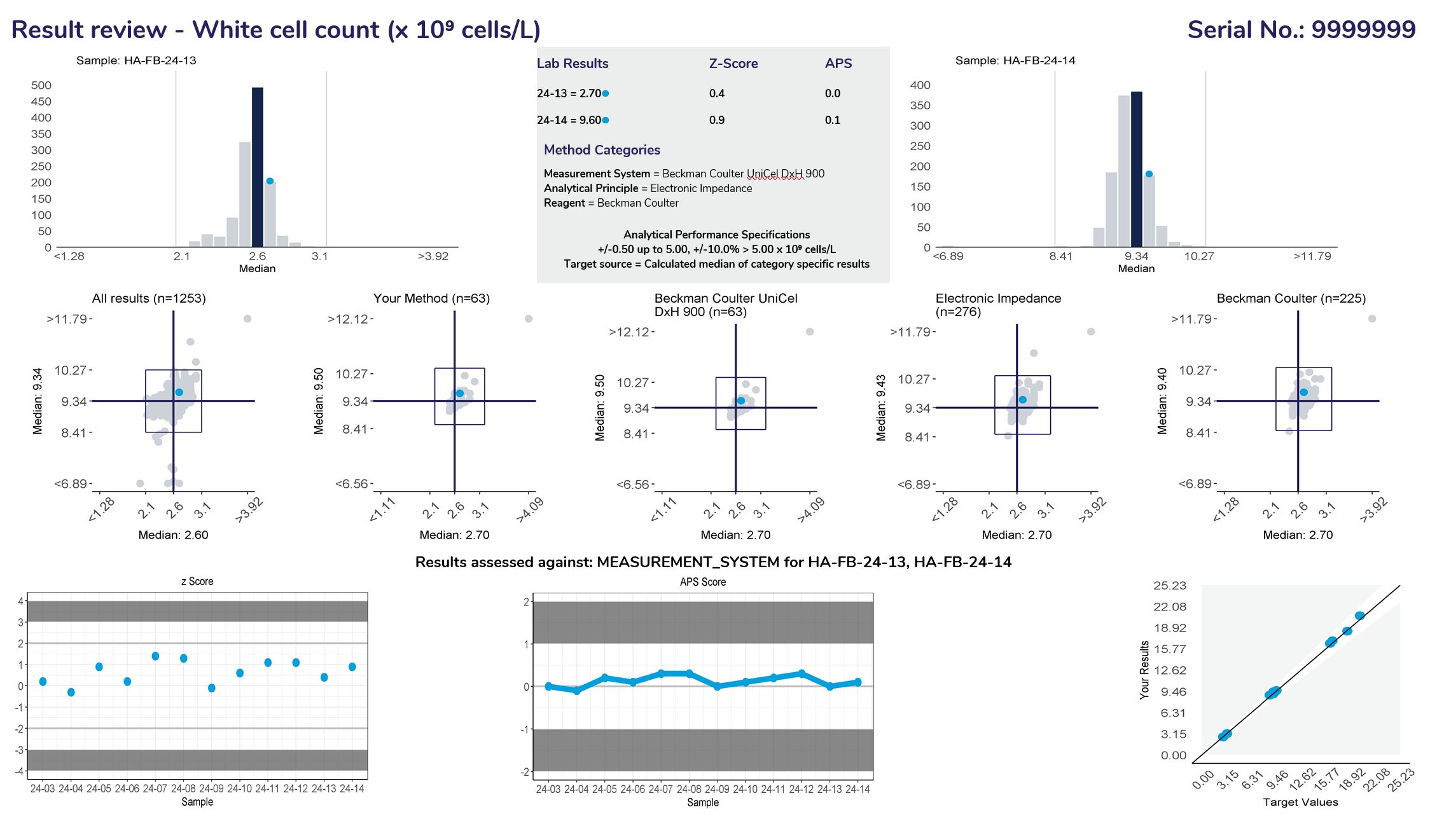
Provide a frequency distribution of the results submitted by all participants. The blue bar represents the median or target result, the blue circle indicates the participant’s result.
Lists the results and method categories returned by the participant.
The APS that has been assigned to the measurand.
Represent a scatter of two sample results plotted against each other. The sample with the higher measurand level is on the y-axis plotted against the lower level on the x-axis. Five Youden plots are presented and illustrate from left to right, results from all results, the participant’s method, analytical principle, measurement system and the reagent. The participant’s result is highlighted by the blue dot.
Examples of Youden charts
| Biased results | Biased Laboratory |
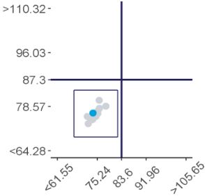 |
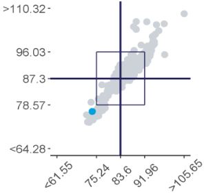 |
Displays the participant’s z-score for up to 6 sets of returned results and provides an indication of the precision and accuracy of results within a survey year.
Displays the APS score for up to 6 sets of returned results and provides an indication of the precision and accuracy of results within a survey year.
Examples of Plots
| Imprecision | Bias |
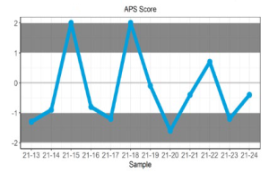 |
 |
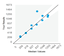
Displays the participant result against the expected result, and indicates linearity across different survey sample levels.
Examples of Plots
| Imprecision | Bias |
 |
 |
Measurand performance: The Measurand performance page provides participants with a breakdown of the results returned.
Provide a frequency distribution of the results submitted by all participants. The blue bar represents the median or target result, the blue circle indicates the participant’s result.
Lists the results and method categories returned by the participant.
The APS that has been assigned to the measurand.
Represent a scatter of two sample results plotted against each other. The sample with the higher measurand level is on the y-axis plotted against the lower level on the x-axis. Five Youden plots are presented and illustrate from left to right, results from all results, the participant’s method, analytical principle, measurement system and the reagent. The participant’s result is highlighted by the blue dot.
Examples of Youden charts
| Biased results | Biased Laboratory |
 |
 |
Displays the participant’s z-score for up to 6 sets of returned results and provides an indication of the precision and accuracy of results within a survey year.
Displays the APS score for up to 6 sets of returned results and provides an indication of the precision and accuracy of results within a survey year.
Examples of Plots
| Imprecision | Bias |
 |
 |
Displays the participant result against the expected result, and indicates linearity across different survey sample levels.
Examples of Plots
| Imprecision | Bias |
 |
 |
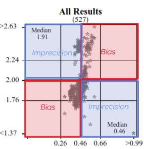
Precision and Accuracy
High / Low or Low / High = Imprecision
High / High or Low / Low = Bias
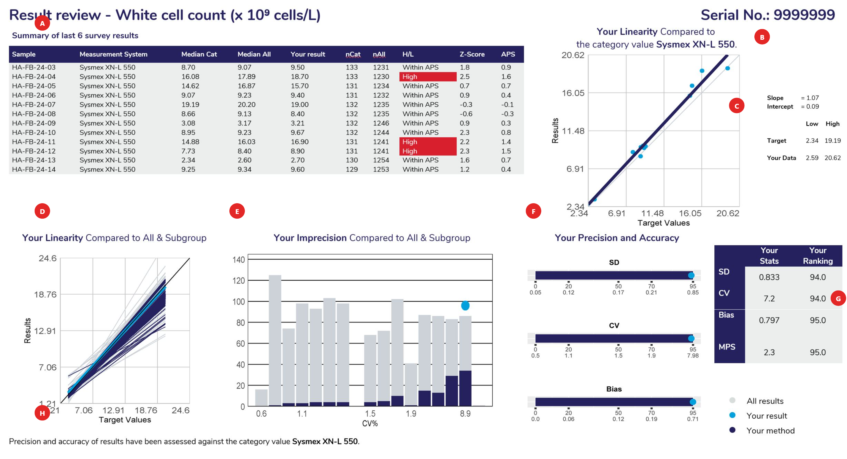
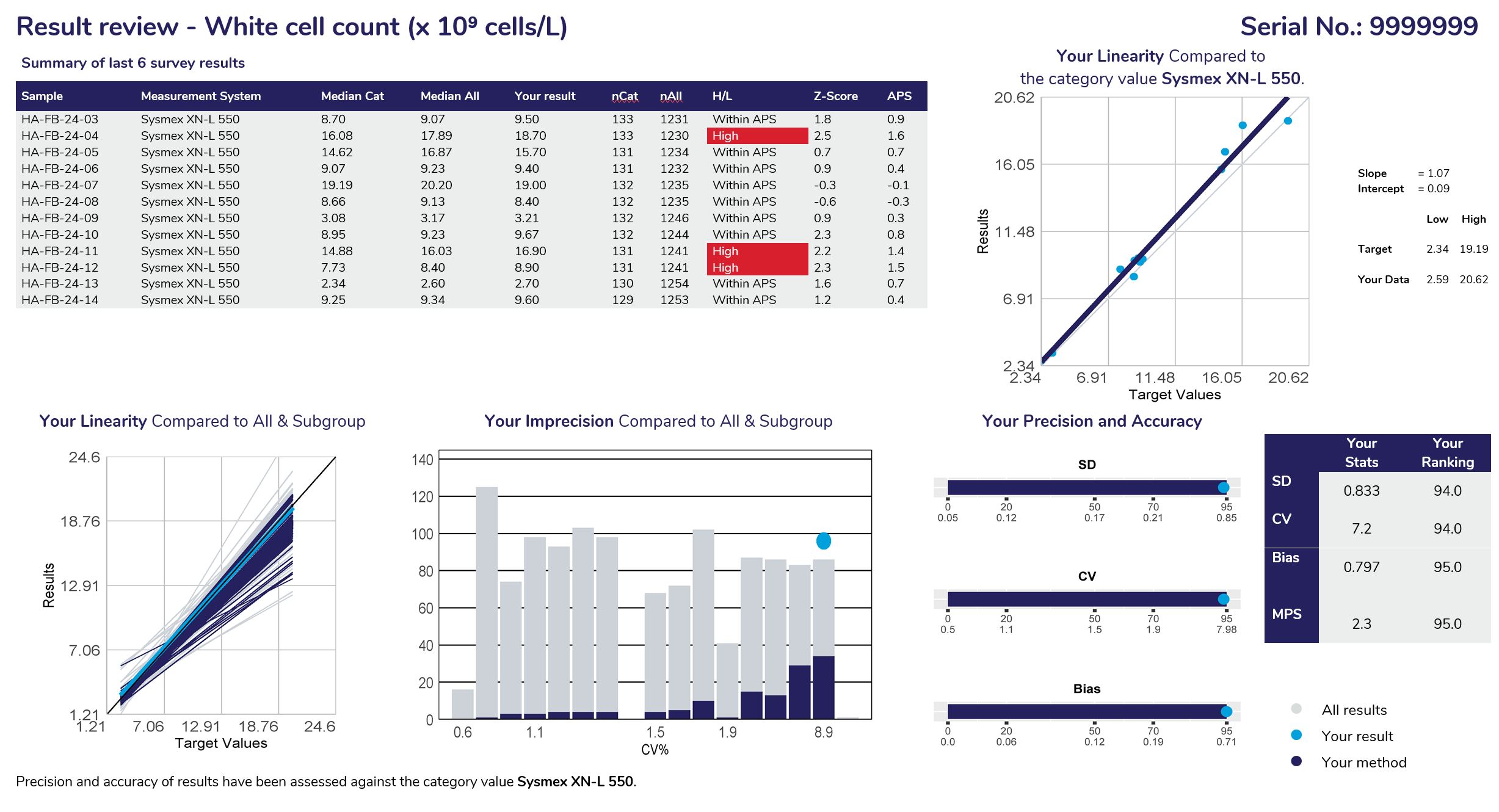
Displays the samples used to calculate linear regression analysis, the assessment category value (the WCC example above shows results assessed against the instrument category – Sysmex XN-L 550). The table columns represent the Sample ID, Measurement System category assigned for result comparison, median result for the method category, median of ALL results, participant’s result, number of results from the method category, number of results from all results submitted, H/L review flag (W= Within, no review required), Z-score and the APS score.
Linear regression analysis is based against the target source of each sample, which could be the “median of all results”, “median of the assessment category” (measurement system) or the median of a “specified target”.
When performing linear regression, the following rules of assessment are applied:
Provides the slope and intercept calculated from the linear regression analysis. Also provides the target low and high level, with your corresponding low and high levels determined from the “line of best fit”.
Using the slope and intercept the values of your line of best fit are determined compared to the lowest and highest target values for the cycle.
To provide a comparison of all methods, linear regression is performed against the same data source (all results or specific target). The slopes represent the bias obtained from all laboratories, illustrating the slopes from all labs in ‘grey’, the slope from participants using the same assessment category in ‘navy blue’ and highlighting your slope in ‘light blue’.
This histogram represents the imprecision (CV%) obtained from all laboratories. It is calculated from the scatter around the target source linear regression line of best fit. The histogram illustrates all labs in ‘grey’, participants using the same assessment category in ‘navy blue’ and highlighting your CV% as a ‘light blue’ dot.
Provides participants with the SD, CV and Bias calculated from linear regression and how your results ranked against all laboratories that participated. Ranking (from 0 or best to 100, worst) is illustrated on the top row of the scale provided under the bar.
Standard Deviation: The SD is the standard error of the estimate (Sy.x) and can be regarded as the average SD across the range of concentrations analysed. SD provides a value in the units of the test. SD will tend to be high if you report high results and low if you report low results.
Coefficient of Variation: The SD divided by the mid-point of your laboratory’s range of concentrations, expressed as a percentage:
| CV%= | SD | x100 |
| (low value + high value)/2 |
| Average Bias:
Your biases at the low value, high value and mid value are determined. These are the differences between the line of expectation (45° line) and your line of best fit. |
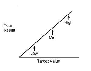 |
The average bias is calculated as:
| Bias = | [low bias] + [mid bias] + [high bias] |
| 3 |
Provides participants with a table summarising their SD, CV, Bias, MPS and performance ranking.
Provides participants with information, such as the target source used for linear regression and lists any method category changes made across the survey sample range being analysed.
Displays the samples used to calculate linear regression analysis, the assessment category value (the WCC example above shows results assessed against the instrument category – Sysmex XN-L 550). The table columns represent the Sample ID, Measurement System category assigned for result comparison, median result for the method category, median of ALL results, participant’s result, number of results from the method category, number of results from all results submitted, H/L review flag (W= Within, no review required), Z-score and the APS score.
Linear regression analysis is based against the target source of each sample, which could be the “median of all results”, “median of the assessment category” (measurement system) or the median of a “specified target”.
When performing linear regression, the following rules of assessment are applied:
Provides the slope and intercept calculated from the linear regression analysis. Also provides the target low and high level, with your corresponding low and high levels determined from the “line of best fit”.
Using the slope and intercept the values of your line of best fit are determined compared to the lowest and highest target values for the cycle.
To provide a comparison of all methods, linear regression is performed against the same data source (all results or specific target). The slopes represent the bias obtained from all laboratories, illustrating the slopes from all labs in ‘grey’, the slope from participants using the same assessment category in ‘navy blue’ and highlighting your slope in ‘light blue’.
This histogram represents the imprecision (CV%) obtained from all laboratories. It is calculated from the scatter around the target source linear regression line of best fit. The histogram illustrates all labs in ‘grey’, participants using the same assessment category in ‘navy blue’ and highlighting your CV% as a ‘light blue’ dot.
Provides participants with the SD, CV and Bias calculated from linear regression and how your results ranked against all laboratories that participated. Ranking (from 0 or best to 100, worst) is illustrated on the top row of the scale provided under the bar.
Standard Deviation: The SD is the standard error of the estimate (Sy.x) and can be regarded as the average SD across the range of concentrations analysed. SD provides a value in the units of the test. SD will tend to be high if you report high results and low if you report low results.
Coefficient of Variation: The SD divided by the mid-point of your laboratory’s range of concentrations, expressed as a percentage:
| CV%= | SD | x100 |
| (low value + high value)/2 |
| Average Bias:
Your biases at the low value, high value and mid value are determined. These are the differences between the line of expectation (45° line) and your line of best fit. |
 |
The average bias is calculated as:
| Bias = | [low bias] + [mid bias] + [high bias] |
| 3 |
Provides participants with a table summarising their SD, CV, Bias, MPS and performance ranking.
Provides participants with information, such as the target source used for linear regression and lists any method category changes made across the survey sample range being analysed.
The assessment criteria are defined as measurand performance. As analytical error is due to both imprecision and bias, program organisers have defined Total Error as follows:
Total Error = 2SD + Bias
The quality of your laboratory’s performance is then determined by comparing the Total Error to the Analytical Performance Specification at the mid-point of the range of measurand concentrations for the cycle as follows:
| Measurand Performance Score (MPS) = | 2SD + Bias |
| Analytical Performance Specification |
These examples of bicarbonate analyses may assist in understanding this method of assessment.
Example – Laboratory 1
| SD = 0.8 mmol/L | Bias = 0.5 mmol/L |
| Total Error = (2 × 0.8) + 0.5 = 2.1 mmol/L | |
| Measurand Performance = | 2.1 | = 0.84 |
| 2.5 |
Note: When the Total Error is less than the Analytical Performance Specification then the Measurand Performance will be less than 1.0. This is the desired level of performance.
Example – Laboratory 2
| SD = 1.5 mmol/L | Bias = 0.1 mmol/L |
| Total Error = (2 × 1.5) + 0.1 = 3.1 mmol/L | |
| Measurand Performance = | 3.1 | = 1.24 |
| 2.5 |
An undesirable result – due predominantly to imprecision.
Example – Laboratory 3
| SD = 0.5 mmol/L | Bias = 2.0 mmol/L |
| Total Error = (2 × 0.5) + 2.0 = 3.0 mmol/L | |
| Measurand Performance = | 3.0 | = 1.20 |
| 2.5 |
An undesirable result – due predominantly to bias.

The method comparison provides a breakdown of all the methods (assessment category) used by participants and lists the statistics calculated for the latest survey results obtained (left) as well as the Precision and Accuracy results calculated from the linear regression analysis on the sample range used, providing the median values for each method listed, facilitating peer group comparison. The full set of statistics is seen only when there are four or more values in the dataset – three values in the dataset will illustrate the median value only and method categories with two or less users do not present any statistical data.
The “Survey Report Interpretation” flowchart can be found on the RCPAQAP website under “Resources” or can be accessed by clicking this link.
Programs that survey qualitative measurands will also provide a simple, direct comparison of your qualitative results with all results received and with participants using the same method system.
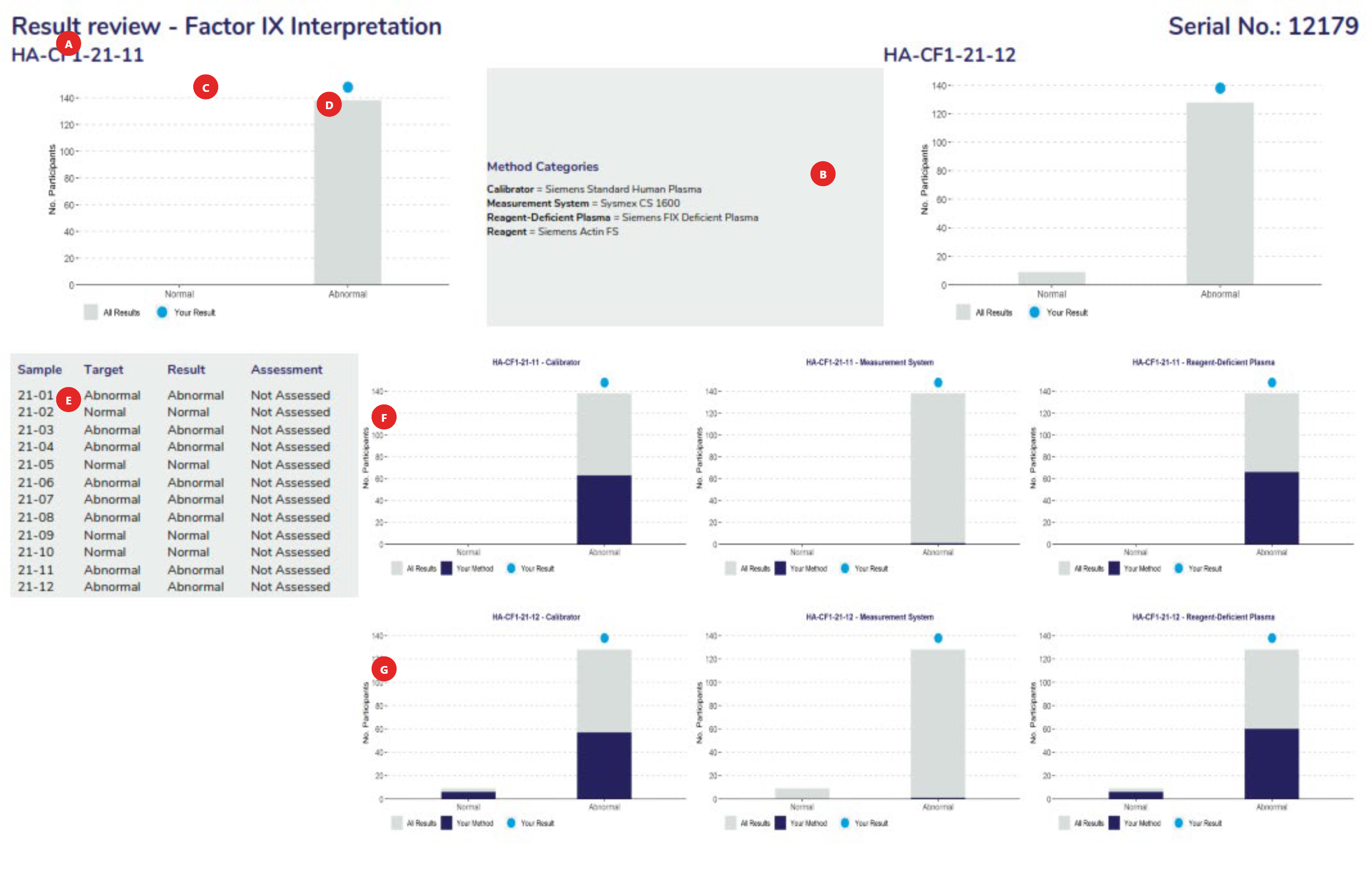

The full name of the measurand.
The method classification the laboratory has submitted. Stored with each pair of results.
Ensure that your method classification is correct. If the method classification information provided by us does not allow for adequate definition of your method then contact the RCPAQAP.
Note: Measurands with no method classification and no results will not be printed. Consequently, if you wish to receive a report for a measurand for which you do not submit results then provide a method classification.
Histograms showing the distribution of all results.
Relative position ● of the result reported by your laboratory.
A complete record of data held by program organisers for the cycle.
These Histograms show the distribution of results for your method, your analytical principle and your reagent group across the assessment criteria groupings for the first sample analysed in this assessment.
These Histograms show the distribution of results for your method, your analytical principle and your reagent group across the assessment criteria groupings for the second sample analysed in this assessment.


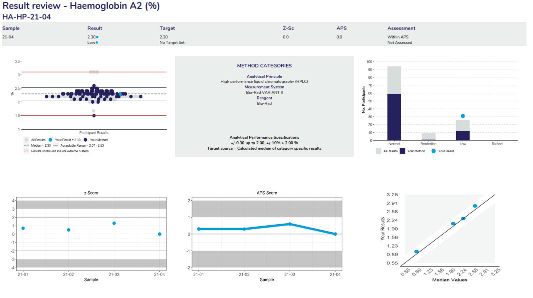
The full name of the measurand and the units reported in.
The method classification the laboratory has submitted. Stored with each pair of results.
Ensure that your method classification is correct. If the method classification information provided by us does not allow for an adequate definition of your method then contact the RCPAQAP.
Note: Measurands with no method classification and no results will not be printed. Consequently, if you wish to receive a report for a measurand for which you do not submit results then provide a method classification.
Scatterplot showing the distribution of all results (grey dots). Results highlighted in dark blue are peer-group results representing the main variable in the test method. In this case, the measurement system. The light blue dot (●) represents the participant’s result.
Histogram showing the distribution of all results (grey bars). Results highlighted in dark blue are peer-group results representing the main variable in the test method. In this case, the measurement system. The light blue dot (●) represents the participant’s result.
Lists the APS and target source for the quantitative measurand.
Represent the cumulative z-scores for all samples sent throughout the survey year.
Represent the cumulative APS scores for all samples sent throughout the survey year.
Indicates the performance of each quantitative measurand based on the level of the measurand.


The full name of the measurand and the units reported in.
Provides a summary of quantitative survey results to date, listing the main variable of the testing method, median of the peer group (Median Cat) and median of all results (Median All). Also listed is the nCat (number of results in the peer group), nALL (number of results in total), H/L (the assessment of results), the z-score and APS score.
Each report will provide a method comparison table to review the performance across all methods for the quantitative and qualitative measurands. Groups with less than four users will not provide quantitative results with an SD or CV. Groups with less than three users will not provide a median or mean result.
Programs that have a diagnostic component or a final interpretation will include an additional page to review performance from all results. Results use the standardised assessment grades used across disciplines of Concordant, Minor discordant, Differential Diagnosis or Discordant.

If applicable, commentary will follow based on the submitted results from participants.

Cumulative assessment is provided to allow participants to monitor performance over the survey year and will include assessment for all measurands if applicable.
These programs are diagnostic programs, in which technical and diagnostic components are assessed.
Technical components consist of descriptive exercises that exist in the Morphology, Paediatic Morphology and Malarial Parasite programs. Participants are asked to describe the cell types seen on either the virtual images or slides supplied in the survey challenge. The assessment for the technical exercise uses a scoring system to assess the performance of participants, which allocates scores for correct descriptions.
These programs also provide a diagnostic component that uses terms such as Concordant, Minor discordant, Differential diagnosis or Discordant to assess survey results.
Note: For performance evaluation for those laboratories participating in the Morphology and Paediatric Morphology modules, results from laboratories classified as scientist / medical technologist are assessed for the descriptive component only. From an educational perspective, we actively encourage scientist / medical technologist only laboratories to report a diagnosis where possible.
Specialist haematologist / pathologist reporting laboratories must report both descriptive and diagnostic components.
The report provides participants with a summary of performance, result review, commentary, and cumulative assessment of the year’s performance.

Morphology – Summary of performance, which provides a snapshot of the scores received from the descriptive component and the assessment grade provided for the diagnostic component.

Morphology – Descriptive result review page, providing a breakdown of the descriptive responses returned from participants with scores allocated to each description. Possible scores are capped to accommodate over reporting, displaying the laboratories total score and possible score.
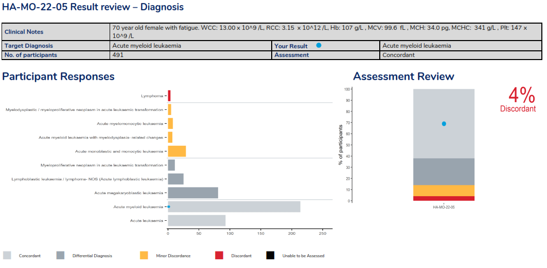
Morphology – Diagnosis result review page, displaying clinical details of the survey case with the target diagnosis and the result returned by the laboratory, providing the assessment. Histograms are also provided, displaying responses received ordered by the assessment of each diagnosis and a histogram to representing the overall assessment.
This program is for laboratories that provide a Haematology Immunophenotyping service using flow cytometry. Laboratories should use their usual technique to stain and analyse the sample. A virtual image of a stained peripheral blood, is supplied via a URL link in survey instructions under the myQAP result entry page, and a brief clinical synopsis are provided. Laboratories must determine the percentage of abnormal cells expressing the relevant antigens and provide a diagnostic interpretation.
Performance Assessment:
Participants must enter their results online before the due date. A core set of antigens are selected based on a consensus phenotype. Antigens are assessed individually, based on their result distribution profile i.e. where results form a cluster. A mean and 2SDs will be applied and results are assessed based on the z-score that is calculated. Z-scores that are greater than 2.0 and less than 3.0 are highlighted for review in ‘amber’, if 3.0 or greater, highlighted in red. Quantitative responses are not assessed if the results of a marker show variation greater than 50%.
The report provides participants with a summary of performance, result review, comprehensive discussion on the case study and cumulative performance for the survey year. Results use the standardised assessment grades used across disciplines of Concordant, Minor discordant, Differential Diagnosis or Discordant.

Summary of performance illustrating the assessment criteria. The table represents the markers reported by the participant, illustrating the result returned, the expected result & calculated mean value, illustrating the assessment. The overall performance provides all measurands that require review for further action.

The result review includes a scatterplot of markers returned by all participants, highlighting the participants results within the scatter as a light blue dot.
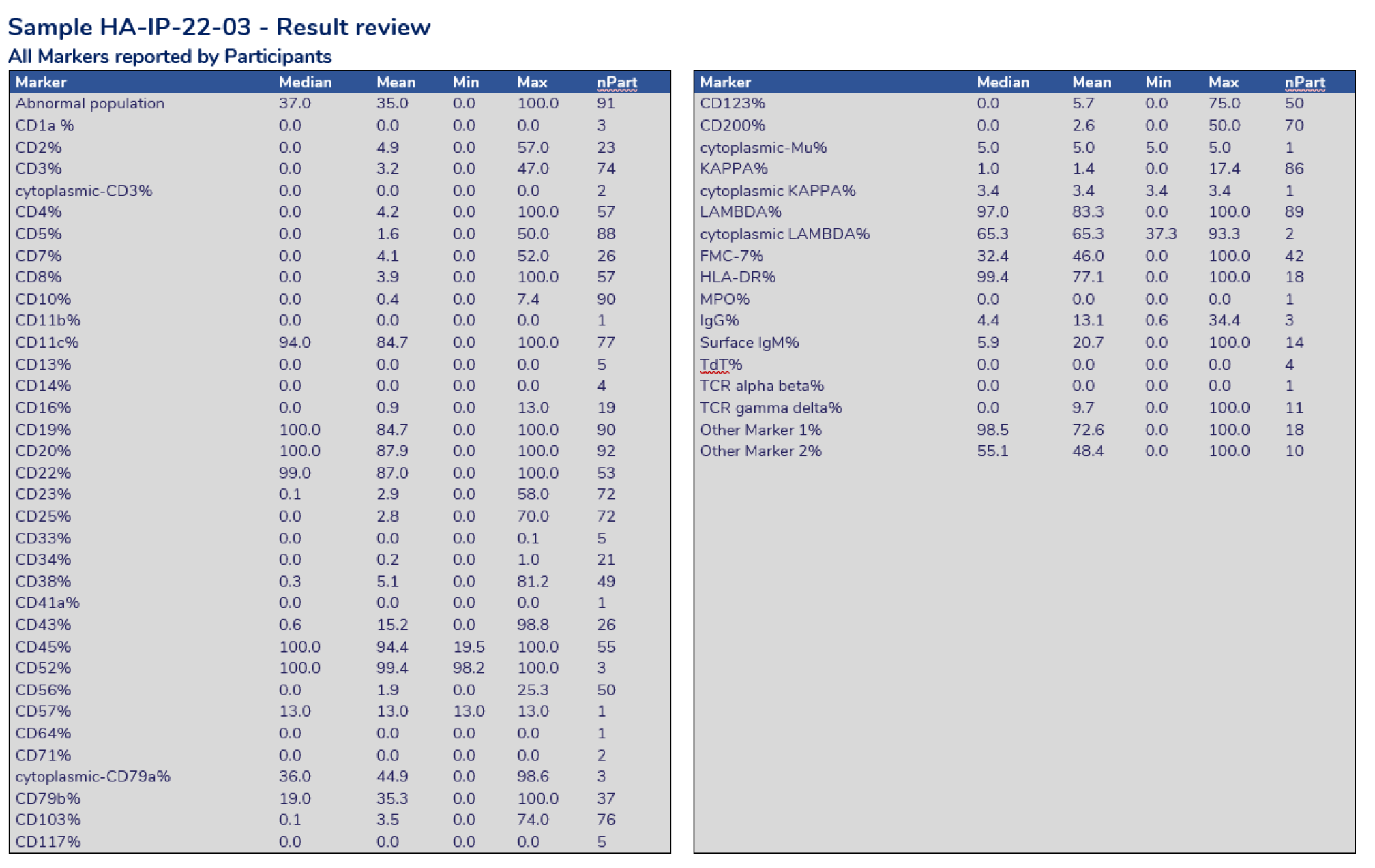
Result review providing the statistics calculated for each marker reported by all participants.

Result Review – Each case study will assign selected markers for assessment. The above charts display a scatter of results for the markers selected. The shaded areas represent results outside 2 standard deviations from the mean value.
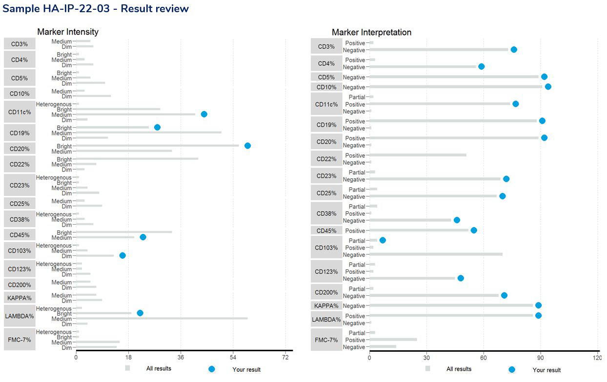
Result Review – provides a breakdown of the interpretive responses received for the selected markers being assessed.
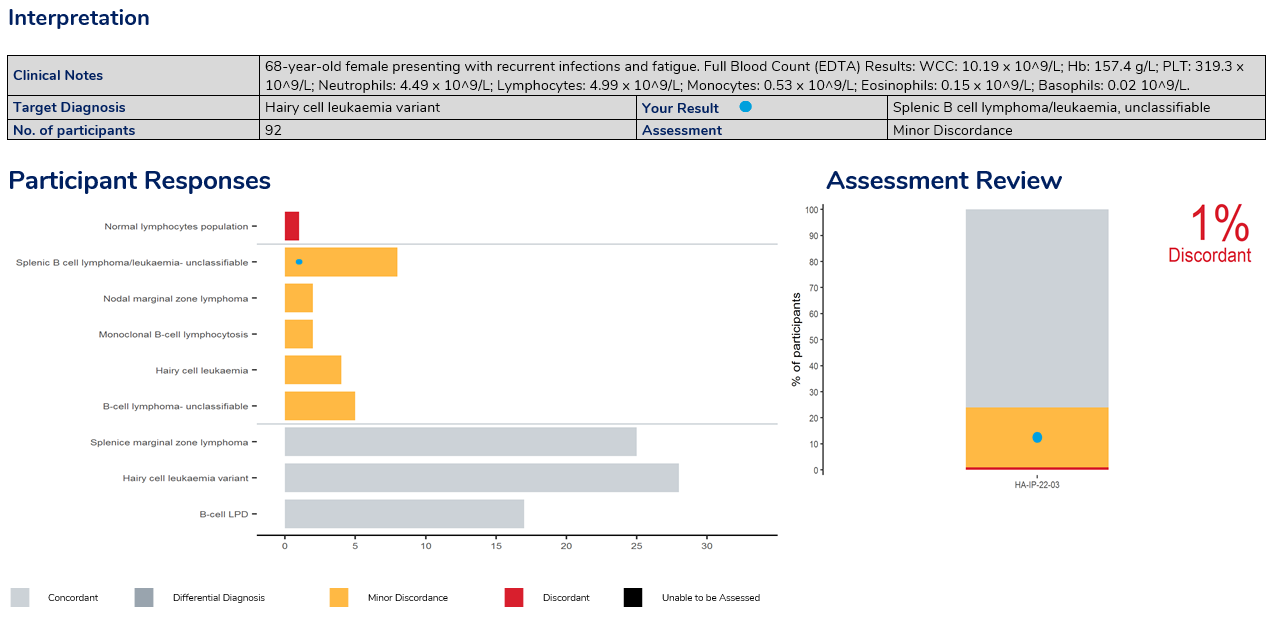
Result Review – the interpretation provides clinical details of the survey case with the target diagnosis and the result returned by the laboratory, providing the assessment.
In this program, two samples are issued in each dispatch, and participants must ascertain the percentage of the PNH clone in each sample. An interpretation must also be provided.
Performance Assessment:
Participants are asked to report the markers that were used to detect the PNH clones for RBCs and WBCs. Assessment of the quantitative results are based on the z-score provided, where Z-scores greater than 2.0 and less than 3.0 are highlighted for review in ‘amber’, z-scores 3.0 or greater are highlighted in red. Assessment of the interpretation is also provided by a concordant or discordant grade to participant responses.
The report provides a summary of performance, result review, commentary and cumulative performance for the survey year.
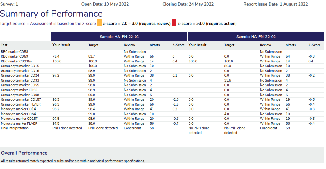
Summary of performance displaying the assessment criteria, providing a table of the markers tested for both samples, highlighting the results returned by the participant, the target result and the assessment provided. The overall performance section will highlight any result that requires review for further action.
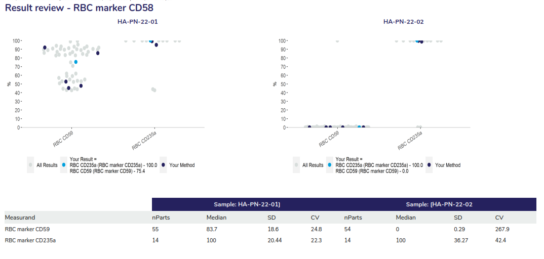
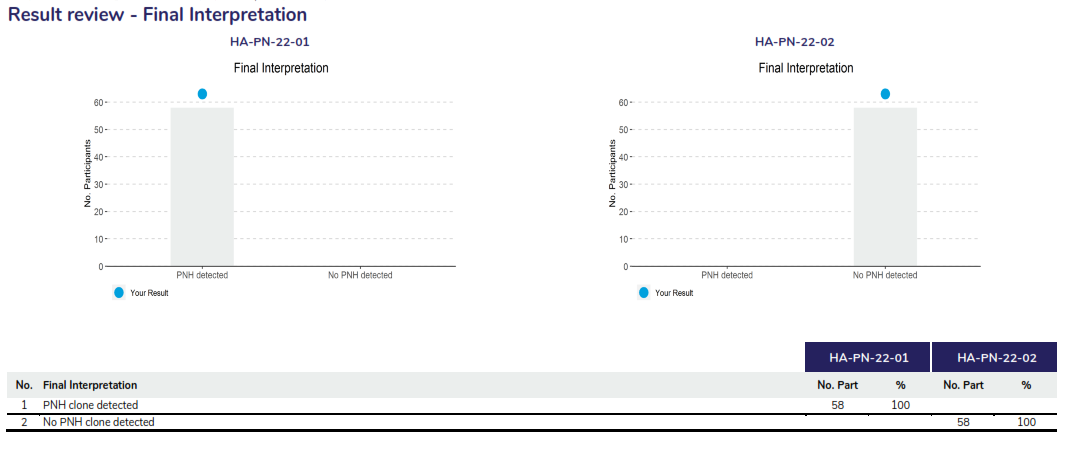
The result review will provide a scatter of the results returned for the RBC and WC markers also displaying a breakdown of the statistical analysis. The example displays all results as grey dots, dark blue dots represent participants using the same method and the light blue dot represents the participant’s results.
Supervisor Reports are designed for a nominated person (Coordinator) who has an interest in overseeing a group of participants and/or sites. This common interest may be regional, organisational, special interest, instrument or reagent groups.
A Supervisor Report may be set up by anyone wanting to set up a collaborative group of participants with a common interest. There must be sufficient participants sharing this common interest to make the generated statistics a true representation of the group. A minimum of five participants is generally suggested to make the Supervisor Report viable.
Each Supervisor Report has a designated Coordinator who is the recipient of the reports and has the responsibility to disseminate information to members of the group and to maintain confidentially of all results.
Supervisor Reports are provided to the nominated Coordinator of the group after each Survey run and at the end of each survey. There is an annual enrolment fee for a Supervisor Report.
New Supervisor Reports
The proposer of a new Supervisor Report should write to the RCPAQAP by logging a request through the myQAP participant portal to request the set-up of the group and to nominate a Coordinator.
The RCPAQAP will liaise with the proposed Coordinator of the group who will be sent Supervisor Report Coordinator Agreement and Supervisor Report Participant Authorisation forms to complete and send back to the RCPAQAP.
Supervisor Reports can be ordered through the myQAP website when enrolling or by contacting the RCPAQAP Customer Service Team directly.
Confidentiality
Program organisers hold information on each participant obtained from the RCPAQAP in strict confidence. The Coordinator of each Supervisor Report undertakes to keep the name of the individual participants confidential and only to release summaries of the performance of methods, instruments and coded results.
Available Supervisor Reports
There are a number of Supervisor Reports that are open to all participants to join. Participants who wish to be part of an existing Supervisor Report can fill in the Supervisor Report Participation Form.
The Supervisor Report Participation Form gives the RCPAQAP permission to release your results to the nominated Co-ordinator of the chosen Supervisor Report for the program(s) you nominate.
Supervisor Report Participation Form
Please follow the link to view the list of available Supervisor Reports and to access the Supervisor Report Participation Form.
Supervisor Report Interpretation Notes
Supervisor Reports are provided to the Supervisor Report Co-ordinator following each survey run. Participant data are included only if they have provided written approval.
An example of the Supervisor report can be found on the myQAP help page.
The CD34+ Program offers participants two samples of stabilised commercial material in each of three surveys per year. Participants are requested to give details of instruments, method and reagents for the “method categories”, and to submit results for the WCC, %CD34 and CD34/μl.
Assessment is based on the enumeration kit for CD34% and Total CD34. Assessment of the WCC is based on the measurement system”.
The CD34 program has adopted the Quantitative reporting system to illustrate participant performance and result review.